
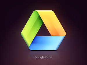
The Google drive icon comes as nothing foreign to most of us. I am sure many of us have used the Google drive for our work and would be very familiar with how the logo looks like. As you can see from both the icons above, there are some subtle yet significant changes to the logo. The logo on the left is the original Google Drive while the one on the right is one of the logos I chanced upon while browsing through Dribbble.com. You can check out the icon here. Personally, I think the logo on the right boosts a more refined look to the logo. This is a classic example where we can see how small subtle changes will affect the overall design integrity of a logo. There are more depth and well defined color gradients as compared to the original logo on the left. The new logo actually helps to elevate the design preventing it from looking too ‘flat’. Of course, it does change the corners from being sharp to rounded ones. Then again, I begin to wonder if Google would adopt new changes for their set of icons? Let me know if you think otherwise. Feel free to give your comments.
